


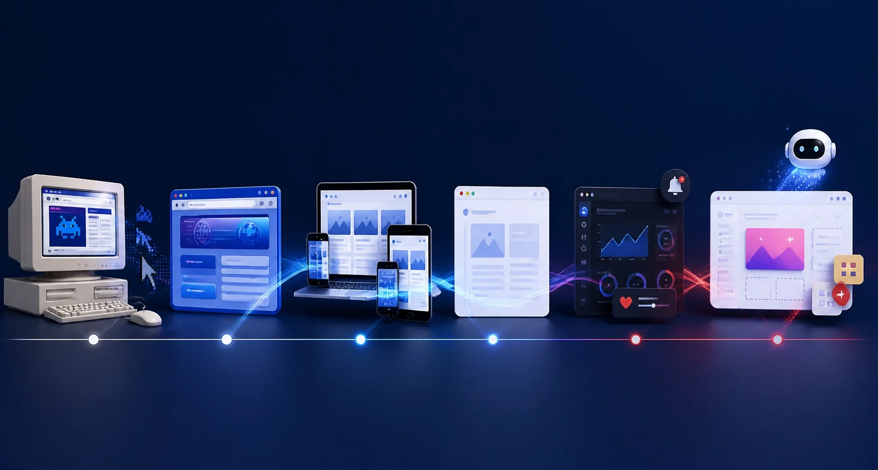
Web Design Trends Through the Years: From Flash Sites to AI-Generated Layouts
Web design has changed dramatically in less than three decades.
The earliest websites were static, text-heavy pages built for desktop screens. Then came table-based layouts, animated Flash introductions, glossy Web 2.0 interfaces, mobile-first design, flat minimalism, dark mode, micro-interactions, and now AI-generated layouts created through intelligent and no-code tools.
Each era solved a specific problem. Each also created new challenges.
For UK small businesses, this history offers an important lesson: effective web design is not about copying the newest visual trend. It is about using the right technology to create a fast, accessible, trustworthy, and conversion-focused customer experience.
As a professional digital marketing agency UK businesses can rely on, Global Marketing Firm combines custom development, UI/UX design, technical performance, and marketing strategy to help businesses turn digital attention into measurable results.
TABLE-BASED LAYOUTS AND FLASH: THE EARLY WEB
WHAT DEFINED THE ERA
In the late 1990s and early 2000s, websites were usually built with basic HTML. Pages were static, layouts were fixed, and most visitors accessed the internet through desktop computers.
Designers soon began using HTML tables to arrange page elements into rows and columns. Tables were not originally intended to control an entire website’s layout, but they gave designers a practical way to create structured pages.
Websites began to resemble digital brochures. They featured:
- Fixed-width layouts.
- Small GIF and JPEG images.
- Basic navigation menus.
- Tiled backgrounds.
- Simple text blocks.
- Limited animation.
Flash then introduced a completely different experience. Designers could add animated introductions, music, interactive menus, games, video, and visually rich transitions. For a short period, Flash websites represented the cutting edge of digital creativity.
WHAT CHANGED
The web moved from plain information delivery to entertainment and interaction. Businesses began to see their websites as brand experiences rather than online brochures.
However, Flash had serious limitations. It often required a browser plug-in, created slow loading times, restricted accessibility, and performed poorly on emerging mobile devices. Search engines also struggled to interpret much of the content inside Flash experiences.
WHAT IT TAUGHT US
Visual impact cannot compensate for poor usability.
A website must load quickly, communicate clearly, work across devices, and remain accessible to as many users as possible. Animation should support the customer journey, not delay it.

CSS AND WEB 2.0: STRUCTURE MEETS STYLE
WHAT DEFINED THE ERA
Cascading Style Sheets, or CSS, changed how websites were designed and maintained. Instead of placing visual styling directly into page content, designers could separate structure from presentation.
This created more control over:
- Fonts and colours.
- Spacing and alignment.
- Borders and backgrounds.
- Page layouts.
- Reusable design components.
- Site-wide style updates.
At the same time, Web 2.0 brought a more social and interactive internet. Websites became platforms for user-generated content, online communities, comments, profiles, and collaboration.
The visual style was distinctive. Glossy buttons, rounded corners, gradients, reflections, badges, and bold colours dominated many websites. Skeuomorphic design also became popular, using realistic textures and familiar physical objects to help people understand digital interfaces.
WHAT CHANGED
Design became more flexible and maintainable. Developers no longer needed to rebuild every page to change a colour or typography style.
The web also became more approachable. Buttons looked clickable. Interface elements resembled objects people already understood. This reduced the learning curve for new internet users.
WHAT IT TAUGHT US
Design systems create consistency and efficiency.
A small business website should not treat every page as a separate project. Reusable components, clear style rules, and consistent calls to action make a website easier to use and easier to grow.
This principle remains central to Global Marketing Firm’s custom web development services. Bespoke websites can be adapted as a business adds services, launches products, expands into new locations, or connects new systems.
RESPONSIVE DESIGN AND THE MOBILE-FIRST SHIFT
WHAT DEFINED THE ERA
The rise of smartphones created the biggest change in web design since the arrival of graphical browsers.
A fixed desktop website could not provide a reliable experience on a small touchscreen. Users needed layouts that adapted to different screen sizes, orientations, and input methods.
Responsive design introduced:
- Fluid grids.
- Flexible images.
- CSS media queries.
- Touch-friendly controls.
- Adaptable typography.
- Mobile navigation patterns.
- Content that reflows across screens.
The design process shifted from creating one desktop page to building a flexible system that worked across desktop, tablet, and mobile.
WHAT CHANGED
Mobile stopped being an afterthought. It became a primary design consideration.
The mobile-first approach encouraged teams to focus on the most important content and actions before adding complexity for larger screens. This often produced clearer websites for every visitor, not only mobile users.
For UK small businesses, this was commercially significant. Customers searching for a local service, restaurant, taxi company, tradesperson, or accommodation are often ready to act from a mobile device. If the website is difficult to navigate or the contact button is hard to find, the customer can move to a competitor within seconds.
WHAT IT TAUGHT US
Design must begin with customer behaviour, not the designer’s preferred screen.
A responsive website is essential, but responsive design alone is not enough. The experience must also be fast, readable, accessible, and focused on conversion.

FLAT DESIGN AND MINIMALISM: CLARITY TAKES PRIORITY
WHAT DEFINED THE ERA
During the 2010s, web design moved away from heavy textures, realistic buttons, and decorative effects. Flat design introduced cleaner interfaces built around:
- Two-dimensional icons.
- Bold but controlled colour palettes.
- Simple shapes.
- Strong typography.
- White space.
- Clear visual hierarchy.
- Reduced decoration.
Minimalism became more than an aesthetic preference. It reflected the need for websites to work efficiently on smaller screens and slower connections.
WHAT CHANGED
Interfaces became easier to scan. Content was given more space. Calls to action became more obvious. Developers also had fewer heavy visual elements to load, helping improve performance.
However, flat design introduced a new challenge. When everything looks simple, users may not know what is clickable. Designers had to use spacing, contrast, shape, labels, and placement to communicate interaction without relying on realistic button effects.
WHAT IT TAUGHT US
Removing unnecessary design is powerful, but removing useful guidance is not.
Minimalism should reduce confusion, not reduce information. Strong design makes the next step obvious while keeping the page focused.
Global Marketing Firm explores this wider relationship between visual style and business communication in its post, Graphic Design Styles Through the Years: From Modern to Contemporary. The same principle applies to web design: style must support purpose.
DARK MODE AND MICRO-INTERACTIONS: DESIGN BECOMES MORE RESPONSIVE
WHAT DEFINED THE ERA
In the late 2010s and early 2020s, websites became more dynamic and personal. Dark mode gained popularity as operating systems introduced system-wide themes. Many websites began offering dark interfaces to improve comfort in low-light environments and create a more immersive visual experience.
Micro-interactions also became a major design feature. These are small responses that provide feedback or guide attention, including:
- Button hover states.
- Form validation messages.
- Animated menu transitions.
- Progress indicators.
- Subtle scrolling effects.
- Loading animations.
- Changes in colour or shape after an action.
Designers also experimented with asymmetrical layouts, overlapping elements, bold typography, and broken grids to give brands a more distinctive identity.
WHAT CHANGED
Websites started responding more visibly to user behaviour. The experience felt less static and more like an application.
This helped communicate system status and improve engagement. A form could confirm that information had been submitted. A button could show that it was ready to use. A menu could open smoothly and preserve context.
WHAT IT TAUGHT US
Motion must have a job.
An animation that confirms an action can improve usability. An animation that delays access to important content can damage it. Dark mode must preserve contrast and readability. Creative layouts must still provide a clear route through the content.
This balance is the foundation of effective UI/UX and app design. The goal is not to add effects for their own sake. The goal is to make digital journeys intuitive, efficient, and commercially effective.
AI-GENERATED LAYOUTS AND NO-CODE BUILDERS: DESIGN ACCELERATES
WHAT DEFINES THE CURRENT ERA
AI is now changing how websites are planned, designed, and built.
Modern tools can generate wireframes, suggest page structures, create copy variations, recommend colour palettes, produce code, and assemble interface components. No-code and low-code builders allow business owners and marketing teams to create sophisticated layouts without writing every line of code manually.
AI-assisted design can help with:
- Initial layout concepts.
- Responsive component variations.
- Personalised content sections.
- Image and graphic generation.
- Rapid prototyping.
- Accessibility checks.
- Design system recommendations.
- Conversion testing ideas.
WHAT IS CHANGING
The time required to move from an idea to a working prototype is falling. Businesses can test more concepts before committing to a final direction.
But automation does not remove the need for expertise. AI-generated layouts can repeat familiar patterns, overlook accessibility issues, create inconsistent branding, or prioritise visual novelty over business objectives.
Human oversight remains essential. A professional team must validate the user journey, technical structure, brand fit, content hierarchy, performance, security, and scalability.
WHAT IT TEACHES US
AI should accelerate good decisions, not replace them.
A business website still needs a clear purpose. It still needs accurate content, trustworthy design, strong calls to action, and a reliable technical foundation. AI is most valuable when it helps a skilled team work faster and test smarter.

WHAT UK SMALL BUSINESSES SHOULD PRIORITISE IN 2026
Web design trends will continue to change, but four priorities remain commercially decisive.
1. SPEED
A visually impressive website that loads slowly loses customers. Large images, excessive scripts, unstable layouts, and poorly configured hosting all create friction.
Our guide, Your Website Is Too Slow? 7 Core Web Vitals Fixes That Will Boost Your SEO Overnight explains practical ways to improve loading performance, responsiveness, and visual stability.
2. USER EXPERIENCE
Customers should understand what you do, who you serve, and what to do next within seconds. Navigation must be straightforward. Forms must be simple. Contact details must be easy to find. Every page should support a meaningful business objective.
3. CONVERSION
Design must guide action. Whether your priority is calls, bookings, enquiries, sign-ups, or online sales, the journey should contain minimal friction.
This is where design and marketing must work together. Effective SEO services for small businesses should bring qualified visitors to a website that is ready to convert them.
4. AI READINESS
AI tools and search experiences increasingly depend on clear content, structured information, technically accessible pages, and reliable brand signals. Businesses should build websites that are easy for people to understand and easy for digital systems to interpret.
That means using clear headings, descriptive content, logical navigation, fast performance, accessible interfaces, and consistent business information.
CREATING THE NEXT ERA OF YOUR WEBSITE
The history of web design is a history of progress. Tables gave way to CSS. Flash gave way to standards-based interaction. Fixed desktop pages became responsive systems. Decorative interfaces became clearer, faster, and more user-focused. AI is now accelerating the process again.
The winning businesses in 2026 will not simply chase the latest trend. They will select technology that improves customer experience and produces measurable commercial value.
Global Marketing Firm delivers end-to-end solutions across custom web and app development, UI/UX design, digital marketing, hosting, infrastructure, and ongoing support. With more than 1,000 projects completed, a 100% on-time delivery record, and an 85% repeat business rate, our team listens, understands, and delivers solutions built for sustainable growth.
Whether you need a high-performing website, a conversion-focused redesign, or an AI-ready digital platform, the right design system creates a stronger foundation for visibility, trust, and revenue.