


From Skeuomorphism to Glassmorphism: UI Design Trends UK Small Businesses Should Care About in 2026
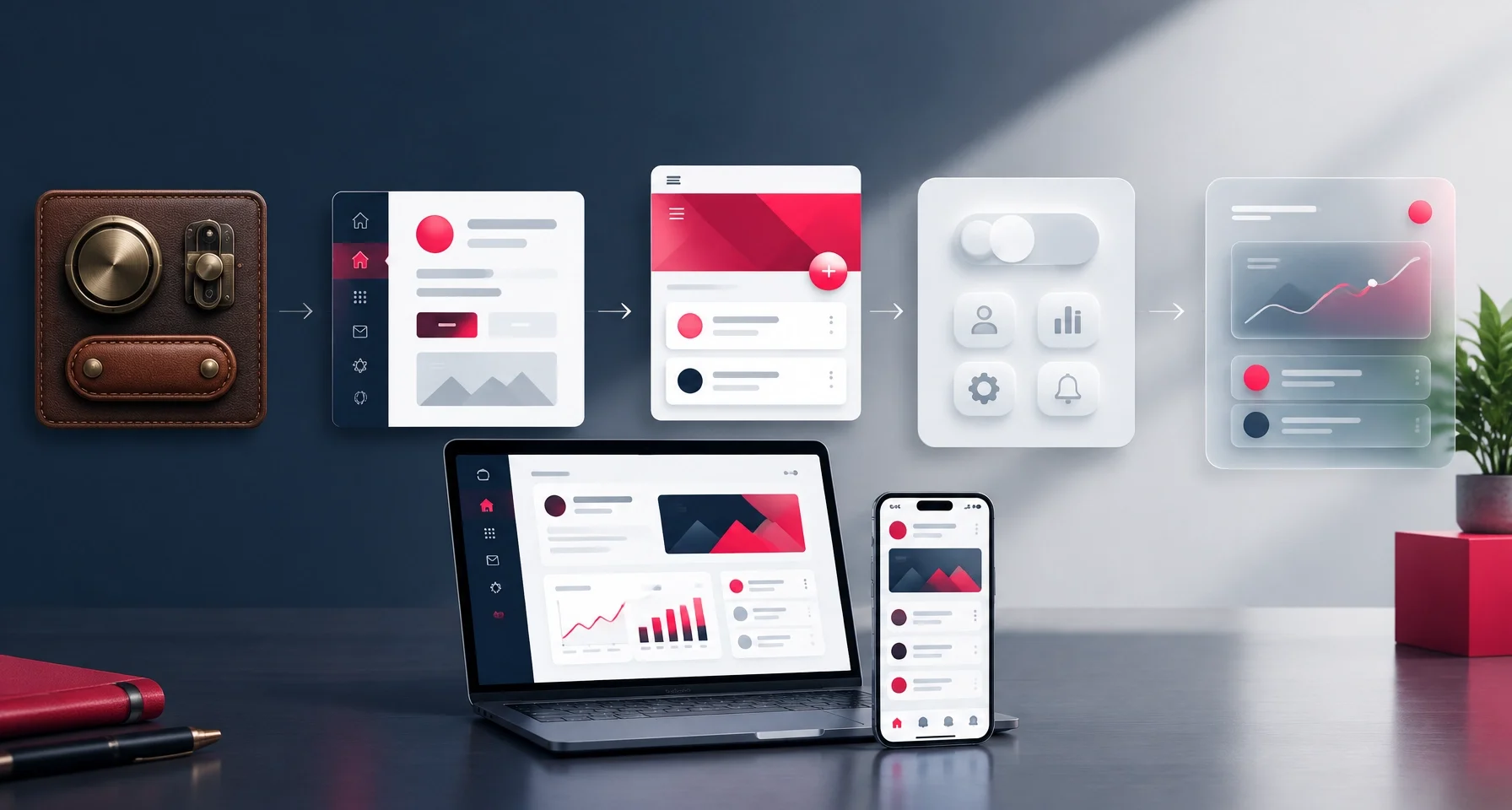
UI design has changed dramatically. Realistic textures gave way to flat interfaces. Flat interfaces evolved into structured material systems. Soft shadows introduced neumorphism. Transparency and blur then brought glassmorphism into the mainstream.
Every movement solved a specific problem. Every movement also created new challenges.
For UK small businesses, the lesson is clear: a fashionable interface is not automatically an effective one. The strongest design in 2026 is fast, accessible, conversion-focused, and easy for people and modern search systems to understand.
This is where professional UI/UX design services create measurable value. Good design does not simply make a website look current. It builds trust, reduces friction, supports SEO, and moves customers towards action.
SKEUOMORPHISM: MAKING DIGITAL INTERFACES FEEL FAMILIAR
Skeuomorphism uses visual cues from the physical world. Digital buttons look like switches. Note-taking apps resemble paper. Calendar interfaces use pages and grids. Leather textures, bevelled edges, reflections, and realistic shadows make digital elements feel tangible.
This approach became popular because people were still learning how to use digital interfaces. Familiar visual metaphors reduced uncertainty. A button that looked raised appeared ready to press. A folder icon communicated storage. A shopping basket represented a purchase journey.
WHAT SKEUOMORPHISM TAUGHT US
Skeuomorphism taught designers that familiarity builds confidence.
For a UK small business, this principle still matters. A booking button should look actionable. A quote form should feel straightforward. A payment section should communicate security. A service card should make the next step obvious.
In 2026, heavy textures and excessive realism can make a website feel dated. However, light skeuomorphism is returning through subtle shadows, gentle gradients, tactile controls, and raised cards.
WHAT TO ADOPT
Use light skeuomorphic cues for:
- Primary calls to action.
- Booking and enquiry forms.
- Pricing cards.
- Payment and checkout elements.
- Icons based on familiar real-world objects.
Avoid decorative textures that distract from the content. Visual cues should explain the interface, not compete with it.
FLAT DESIGN: CLARITY THROUGH SIMPLICITY
Flat design moved in the opposite direction. It removed realistic textures, heavy shadows, reflections, and unnecessary decoration. In their place came simple shapes, bold typography, controlled colour palettes, generous white space, and clear two-dimensional icons.
Flat design became especially valuable as mobile browsing expanded. Smaller screens and slower connections demanded lighter, more efficient interfaces.
WHAT FLAT DESIGN TAUGHT US
Flat design taught us that clarity often outperforms decoration.
A visitor should understand what a business does within seconds. Navigation should feel familiar. The main call to action should stand out. Content should be easy to scan on a phone.
The risk is that excessive minimalism can remove useful guidance. If every element looks flat and identical, users may not know what is clickable.
The solution is not to return to clutter. It is to use spacing, contrast, labels, hover states, focus indicators, and consistent component patterns to communicate interaction.
This is particularly important for businesses investing in SEO services for small business. Search visibility brings visitors to your site, but clear design helps turn those visits into calls, bookings, enquiries, and sales.

MATERIAL DESIGN: CREATING A SYSTEM THAT SCALES
Material design introduced a structured visual language based on surfaces, depth, motion, grid systems, typography, and reusable components. It gave designers and developers a consistent framework for creating interfaces across websites, apps, and devices.
Rather than treating every page as a separate design project, material design encouraged teams to build systems. Buttons, forms, menus, cards, alerts, and navigation patterns could be reused and improved over time.
WHAT MATERIAL DESIGN TAUGHT US
Material design taught us that consistency improves usability and efficiency.
A small business website becomes easier to manage when the same rules apply across every page. A customer should not need to relearn the interface when moving from a service page to a contact form. A business should also be able to add a new location, service, or product without redesigning the entire website.
This is where design and development must work together. Global Marketing Firm combines custom UI/UX thinking with web development services and app development services to create scalable digital experiences rather than disconnected pages.
WHAT TO ADOPT
Build a simple design system containing:
- Brand colours and typography.
- Button styles and states.
- Form fields and validation messages.
- Card and pricing layouts.
- Navigation patterns.
- Mobile spacing rules.
- Accessibility standards.
- Image and content guidelines.
A practical system protects consistency while allowing the business to grow.
NEUMORPHISM: SOFT DEPTH WITH A SERIOUS ACCESSIBILITY RISK
Neumorphism combines the background and interface surface so that controls appear gently raised or pressed into the page. Soft shadows and highlights create a smooth, almost physical appearance.
The style can look elegant. It can also be difficult to use.
Low-contrast controls may disappear into the background. Buttons may not look clickable. Text can become harder to read. Users with visual impairments may struggle to distinguish one component from another.
WHAT NEUMORPHISM TAUGHT US
Neumorphism taught us that visual appeal must not override usability.
Use soft depth carefully. A subtle raised effect can add hierarchy to a dashboard or card. It should never be the only way users identify an interactive element.
Every important action still needs:
- Sufficient colour contrast.
- A clear label.
- A visible focus state.
- Keyboard accessibility.
- Touch-friendly dimensions.
- Feedback after interaction.
Neumorphism is best treated as a supporting detail, not a complete website direction.
GLASSMORPHISM: PREMIUM EFFECTS USED WITH CONTROL
Glassmorphism uses transparency, blur, layered surfaces, gradients, and soft borders to create a frosted-glass effect. It can make a website feel modern, premium, and technologically advanced.
In 2026, the strongest version is more restrained. Glassmorphism 2.0 uses lower blur levels, stronger contrast, and selective placement. Designers use it for hero cards, pricing panels, dashboards, login areas, and premium feature sections rather than covering every part of the page in translucent layers.
WHAT GLASSMORPHISM TAUGHT US
Glassmorphism taught us that depth can create hierarchy, but only when content remains readable.
Use glass effects to highlight a high-value area. Do not place long paragraphs over a busy background. Do not allow transparency to weaken the contrast of essential information. Do not add multiple blurred layers if they slow down mobile performance.
For most UK small businesses, suitable applications include:
- A hero offer card.
- A prominent booking panel.
- A pricing comparison.
- A membership or subscription section.
- A dashboard or customer portal.
- A short, high-impact promotional banner.
Keep body text on an opaque or darkened reading surface. Maintain a minimum contrast ratio of 4.5:1 for normal text. Test the design on budget smartphones, older devices, and different screen brightness levels.
WHAT ACTUALLY MATTERS FOR UK SMALL BUSINESSES IN 2026
The right interface is not the one with the most effects. It is the one that helps customers act with confidence.
1. CONVERSION-FOCUSED DESIGN
Every page should have a purpose. That purpose could be a phone call, quote request, booking, purchase, registration, or newsletter sign-up.
A conversion-focused interface:
- Explains the offer quickly.
- Shows the customer benefit.
- Provides trust signals.
- Removes unnecessary steps.
- Makes the next action obvious.
A stylish website that leaves visitors unsure what to do is not performing effectively.
2. ACCESSIBILITY-FIRST EXPERIENCES
Accessibility is a commercial requirement, not a design afterthought. Use readable text, logical heading structures, descriptive labels, keyboard navigation, clear focus states, alternative text, and sufficient contrast.
Accessible design improves the experience for everyone, including people using mobile devices in bright sunlight, customers with temporary impairments, and visitors navigating unfamiliar services.
3. SPEED AND TECHNICAL PERFORMANCE
Blur effects, large images, animated backgrounds, and third-party scripts can damage performance. A slow website creates frustration and weakens the impact of every marketing channel.
Our guide, Your Website Is Too Slow? 7 Core Web Vitals Fixes That Will Boost Your SEO Overnight covers practical ways to improve loading speed, responsiveness, and visual stability.
Prioritise:
- Optimised WebP or AVIF images.
- Fast, reliable hosting.
- Deferred non-essential scripts.
- Stable image dimensions.
- Efficient CSS and JavaScript.
- Responsive layouts.
- Testing on real mobile devices.
4. AI-ERA EXPECTATIONS
Customers increasingly discover businesses through search summaries, social platforms, maps, and AI-powered answers. When they reach your website, the experience must immediately confirm that they have found a credible and relevant business.
Clear page structures, descriptive headings, helpful service content, consistent business information, and accessible interfaces help both people and digital systems interpret your website.
Our article on web design trends through the years explores how the industry moved from Flash experiences to responsive and AI-assisted layouts. The consistent lesson is simple: technology should improve the customer journey.
WHAT TO ADOPT, WHAT TO AVOID
For most small businesses, the strongest 2026 approach is a fast, accessible foundation with carefully selected visual accents.
ADOPT
- Light skeuomorphic cues for important actions.
- Flat design for clarity and scanning.
- Material-style component systems for consistency.
- Small neumorphic details where contrast remains strong.
- Glassmorphism for premium focal points.
- Meaningful micro-interactions.
- Mobile-first layouts.
- Clear conversion paths.
AVOID
- Full-page blur and transparency.
- Low-contrast buttons.
- Heavy textures and decorative clutter.
- Animations that delay access to content.
- Trend-led redesigns with no commercial objective.
- AI-generated layouts without expert review.
- Visual effects that increase page weight without improving usability.
The practical priority should always be customer need. As explained in App Design, Web Design and Graphic Design: What UK Small Businesses Actually Need and When, most businesses need a strong website and consistent brand system before investing in more complex digital products.
CREATING UI THAT DELIVERS LONG-TERM VALUE
UI design trends will continue to change. The fundamentals will not.
Customers want fast experiences, clear information, trustworthy interfaces, simple navigation, and reliable support. Search engines and AI systems also favour websites with accessible structures, useful content, and strong technical foundations.
Global Marketing Firm delivers custom design solutions across websites, mobile apps, digital marketing, and technology platforms. Our team listens, understands, and delivers with a 100% on-time delivery record and an 85% repeat business rate.
As a results-focused digital marketing agency UK businesses can rely on, we connect UI/UX design with development, SEO, performance, and conversion strategy. We do not chase visual trends for their own sake. We select the right design choices to create trust, engagement, and sustainable growth.
The best interface in 2026 is not necessarily the most futuristic. It is the one that helps the right customer take the right action with minimal friction.